Images of the City:
A Pattern Language
Computer Vision Analysis of Urban District Visual Identities
Using Google Street View Data
This is the visualization portal for my thesis project - "Images of the City: A Pattern Language",
an exploration of the potential of using large-scale city imagery data set (Google Street View)
in understanding and reading the cities.
Paper:
https://vadl2017.github.io/paper/vadl_0106-paper.pdf
GitHub:
https://github.com/Firenze11/cv_streetview
4 Steps, 4 Experiments
First I will explore the use of city imaginary data in Collecting Spatial Statistic that can be used in the studies of urban planning and design; I will discuss my experiment about mapping urban greenery and mapping building façade colors in 4 American cities.
Method Visualization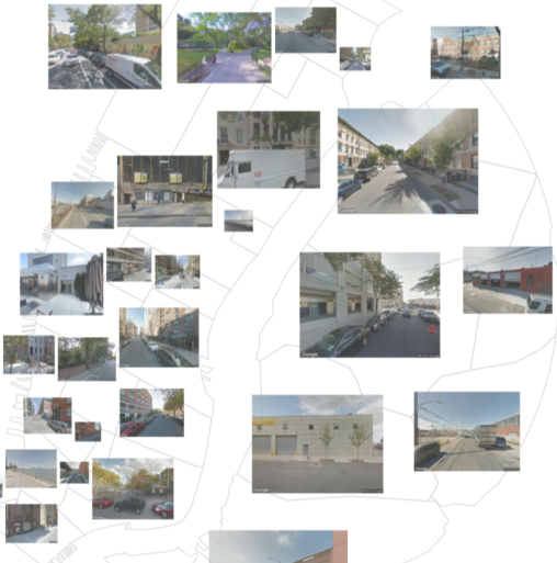
Then I looked at the problem of visual resemblance particularly, and played with a Convolutional Neural Net and train it to identify visually similarity patterns by recognizing cities / neighborhoods from their google street view images.
Method Visualization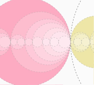
Next I will talk about the limitation of existing neighborhood boundaries, and how to redefine the boundaries based on shared visual characteristics, using a bottom-up approach which I call “the discovery of perceptual neighborhoods”
Method Visualization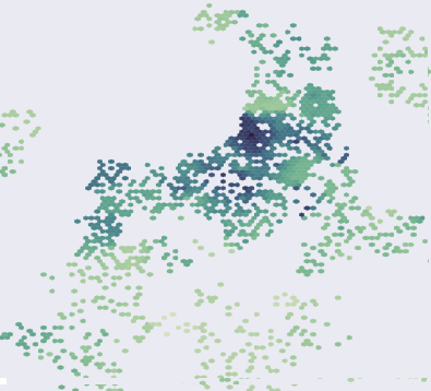
Finally I undertook an exploration into latent urban characteristics that can be reflected visually.
Method VisualizationData Collection
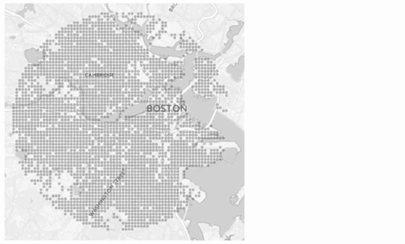
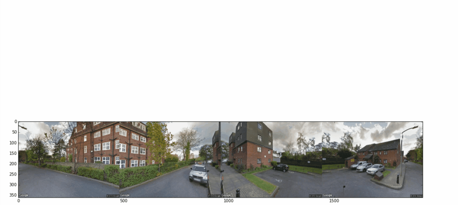
The dataset for this research is collected using Google Street View API from 4 American cities: Boston, Chicago, New York and San Francisco. 4 images are sampled from each grid point within a 6 km radius region covering the major urban area.
Large-scale Spatial Statistic Collection
Semantic Segmentation
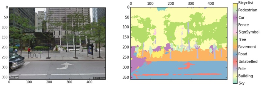
In order to retrieve information from images, the first step is to isolate visual elements
in images. The method I used here is SegNet,
a neural network prediction model which calculates the possibility of each pixel in this image
being in any of the 12 categories.
Simply counting the number of pixels in each class already suffices a lot of tasks such as mapping
the coverage of greenery across city region, where I can use the number of tree pixels as a proxy;
Also sky area should be interesting because it might correspond to building height or urban density;
Building areas should be relevant to study the architectural style etc.
Color Quantization
But studying building styles usually involves some additional steps; for example in this case I was looking into the dominant colors of buildings across the city and how that varies from region to region, so I did this by color quantization using Mean-Shift Algorithm, which was to cluster the RGB values of building façade pixels and extracted the one color that has the highest number of pixels, as the representative color of this coordinate.
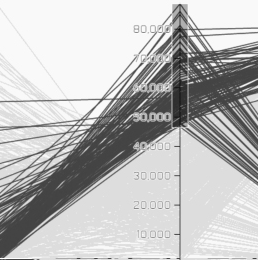
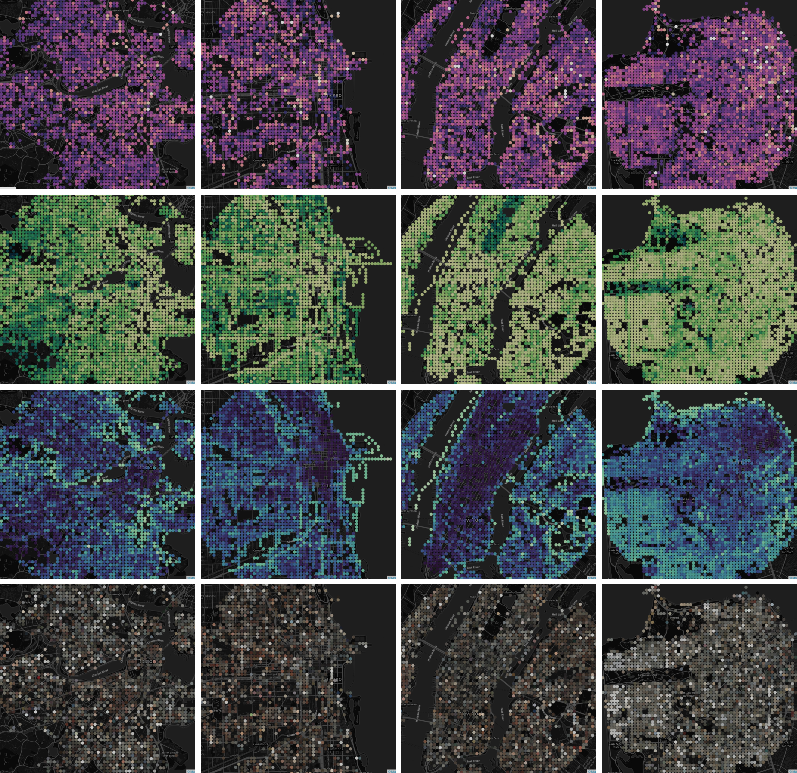
Lots of Images at One Glance
This visualization presents the urban imagery dataset after the algorithmic digest. Each polyline
represents one image; its intersection with each axis is determined by its attribute value.
Brush the axes to see the whether the spatial distribution of visual signals aligns with your
conception about these cities. Click on the map to see whether the attribute values make sense.
-
Boston
-
Chicago
-
New York
-
San Francisco
Zooming in
Choose a visual attribute, and a city...
All Maps
Visual Resemblance in Urban Places
Recognizing Cities/Neighborhoods from Street View
So far we’ve looked at “named”, hand-designed visual features.
In order to evaluate visual similarity in a more comprehensive way, much more visual features
are needed from each image, and an automated process is required for feature extraction.
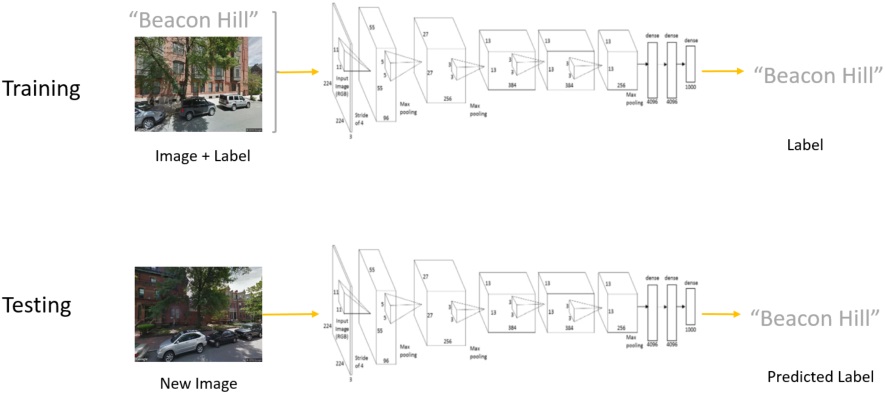
Thus a convolutional neural nets (CNN) is needed for feature extraction.
We used AlexNext structure in
MatConvNet framework and trained 2 models to
classify images according to their city names and neighborhood names, respectively.
The figure above shows how error rate and energy descends as the training epoch increases.
Also noticeable is that recognizing neighborhoods is a harder task than cities judging from the final error rates.
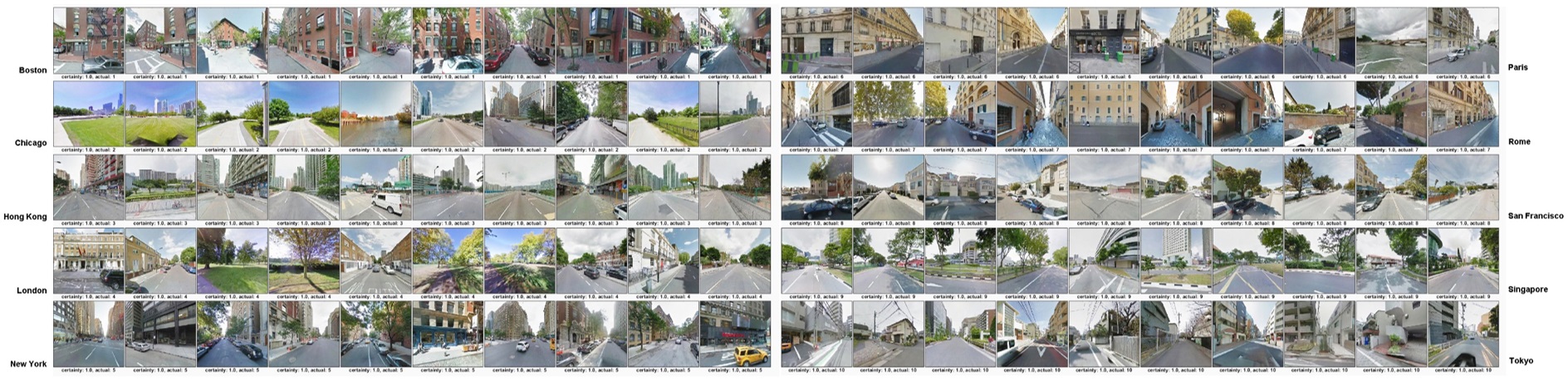
Epitomic Images for Each City
So let’s look at what the algorithm has learned and whether it makes sense to human beings. Here I plotted the top 10 confident predictions for each of the 10 cities. It's discernible that those from the same category demonstrate some visual similarities, which generally conform to human's impression about those places.
Categories that the Algorithm Cannot Distinguish
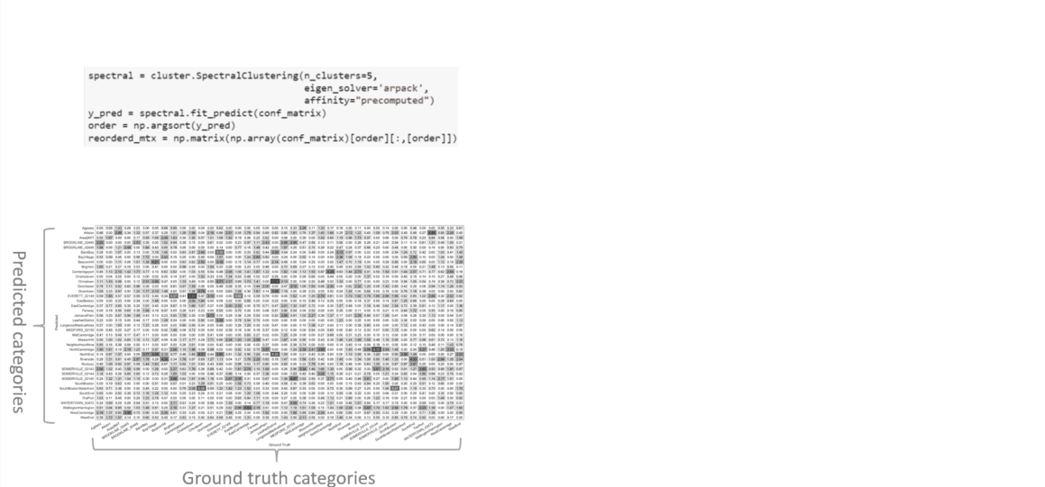
Apart from what’s being captured by the algorithm, what the algorithm cannot learn is also
interesting to know. Intuitively, some neighborhoods are more similar to each other than others,
which might reflect important facts about the cities including zoning, cultural influence, or the
trend of urban sprawl. How are we going to discover these?
Here is a way to evaluate which neighborhoods may look similar to each other. On the left, I recorded
all the cases of mis-classification, which formulates a matrix with ground-truth categories ("real"
categories of each image) on the X axis and predicted categories on the Y axis. The matrix in turn
can be considered as a node-link graph where nodes represent all the categories and links represent
the levels of similarities between each pair of categories. Then a
Spectral Clustering Algorithm
can be applied to this graph and cluster the nodes based on how strongly they are linked with each other.
Which Neighborhoods Look Alike
The Node-Link chart shows the affinity graph based on visual confusion among neighborhoods, which are represented by circles whose colors denote their city. Their spatial approximation is determined by link lengths which are reversely related to their visual similarities.
-
Boston
-
Chicago
-
New York
-
San Francisco
The Appearances of Districts
Choose a city to view images...
Lorem ipsum dolor sit amet, consectetuer adipiscing elit. Aenean commodo ligula eget dolor. Aenean massa. Cum sociis natoque penatibus et magnis dis parturient montes, nascetur ridiculus mus. Donec quam felis, ultricies nec, pellentesque eu, pretium quis, sem. Nulla consequat massa quis enim. Donec pede justo, fringilla vel, aliquet nec, vulputate eget, arcu. In enim justo, rhoncus ut, imperdiet a, venenatis vitae, justo. Nullam dictum felis eu pede mollis pretium. Integer
Discovering Perceptual Neighborhoods
Neighborhood-based Classification is not Good Enough
However, neighborhood-based classification is not good enough for the task of urban district visual
property identification. The reasons are:
1, The granularity of neighbrhood is simply not fine enough. Visual variance within a same
neighborhood usually defies blanket description;
2, “Official” boundaries of neighborhoods are prone to human manipulation and don’t necessarily conform
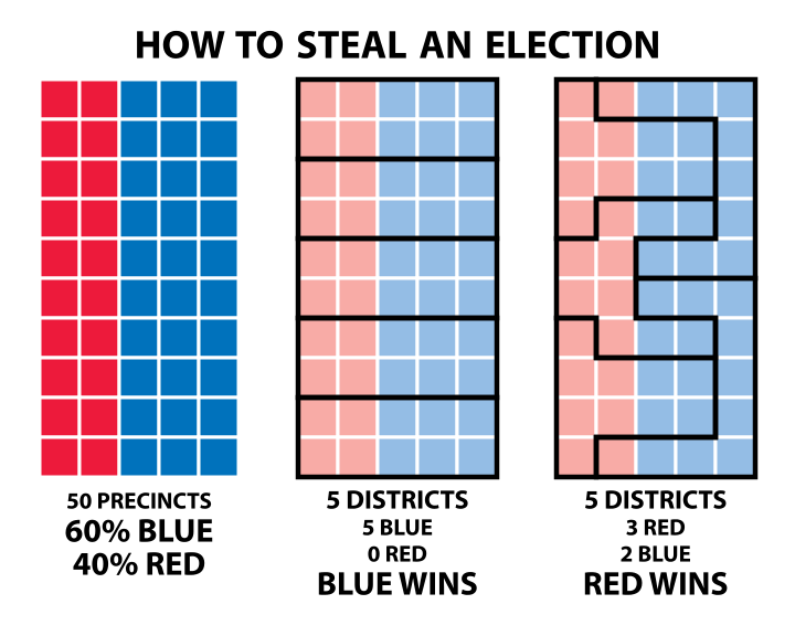
to “perceptual neighborhoods”. One example here is gerrymandering,
where politicians for specific reasons, redistrict natural neighborhoods into new political boundaries
so that they get more vote from the populations by region;
3, The method is not adequate to detect visually similar sub-regions among different neighborhoods,
an interesting pattern that indicates how prototypical design patterns have influence across borders.
Bottom-Up Deep Features Clustering Approach
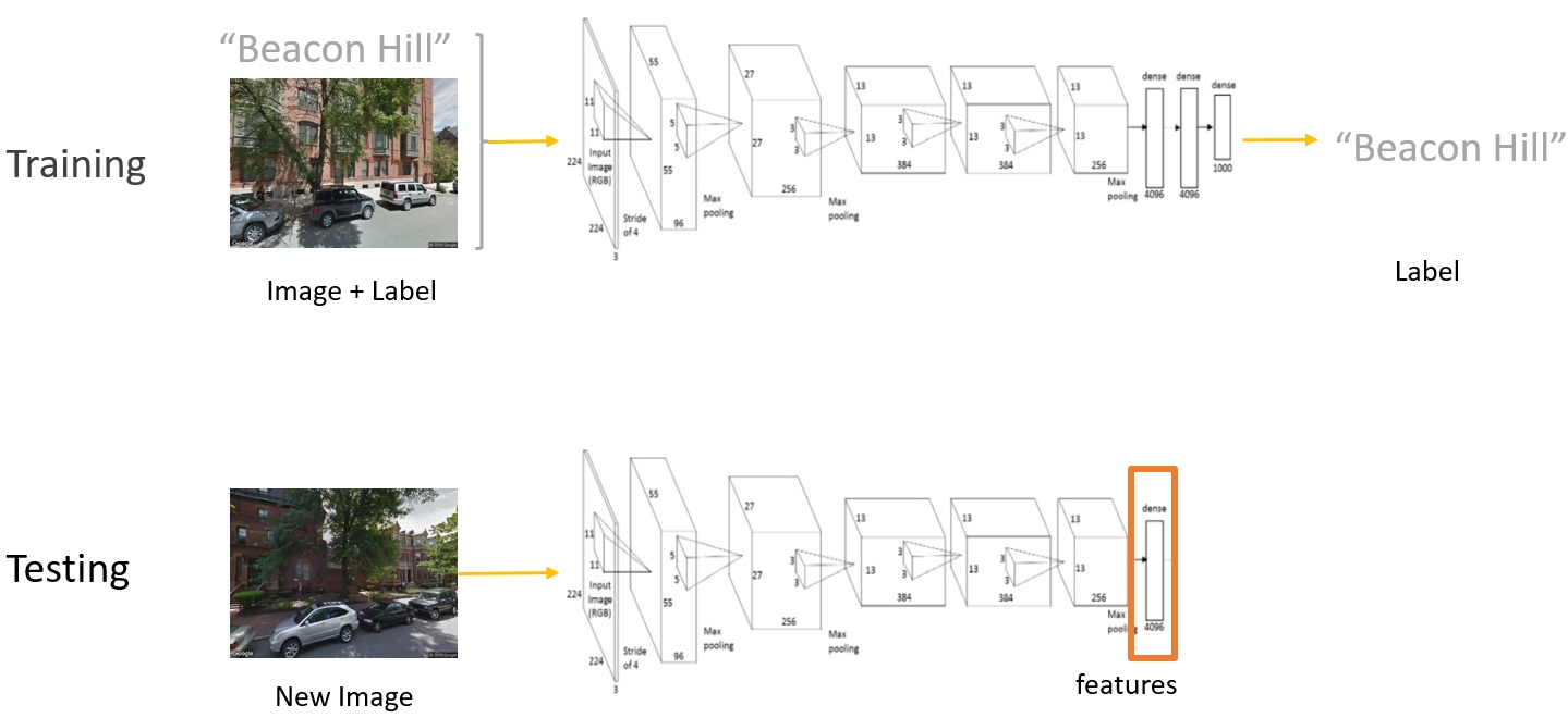
And that’s why a new method is needed in order to redefine the boundary of neighborhoods,
possibly purely from image features, using a bottom-up approach.
Here is how I went about it. Going back to the neural network, instead of looking at the prediction
result, I only extracted the second-to-last layer of the neural nets which contains “deep features”
of each image. These feature are extracted by all the previous layers, and are just ready to do the
classification.
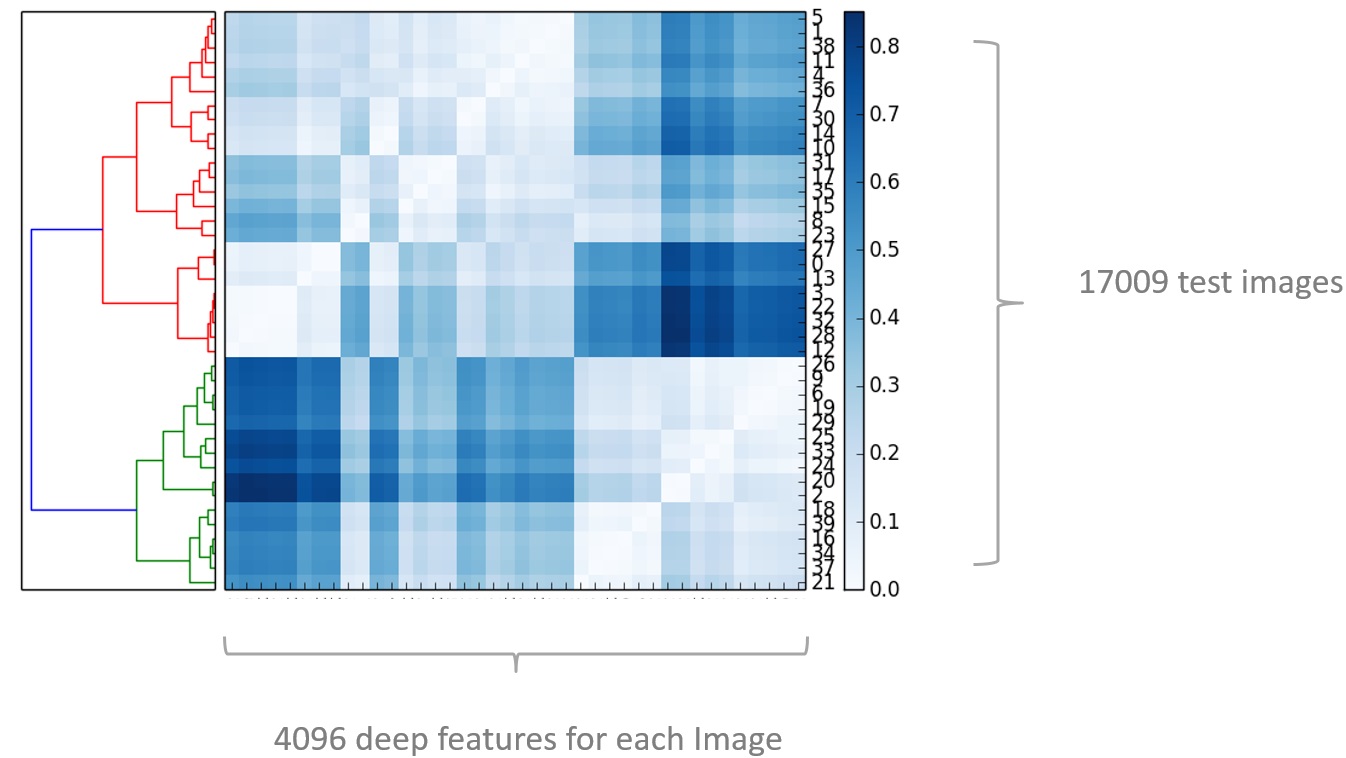
Then I implemented a bottom-up clustering algorithm on these features. In this matrix you can
imaging that each row represent each of the images, and all the columns represent all the 4096
features of each image. The way this algorithm works, is by merging the most similar pair of images
into one cluster, and then merge with the second most similar, and then the third… all the way up
to the top there everything becomes one cluster.
The nice thing about this algorithm is that not only it produces a specific clustering, but also
computes a hierarchy of clusters and we can cut the dendrogram at any desired threshold (i.e.
level of similarity), to get any number of clusters.
The Structure of Urban Space
Click on th root node (which contains all the images) and watch it branches out. Different colors
in all three charts represent the same set of images.
From the tree diagram on the top, you could
find out the similarity hierarchy, as well as the threshold level at which they are merged with
sibling categories (indicated by their X coordinates). On the other hand, the circle-packing chart
at the bottom expresses more clearly the containment or parent-child relationship between different
sets of images. The sizes of the circles correspond to the number of images in that set.
Also, click on the circles there to view samples of images from each set.
As can be seen from the map, the geo-spatial distribution of image clusters conforms to humans'
intuition about the outcome of this image clustering approach:
At a local scale:
Visually similar images should also display a tendency to be geo-spatially close to each other
(because e.g. high-density areas within one city tend to concentrate);
At a global scale:
Corresponding districts in different cities / regions should also be visually close to each other
(because e.g. high-density areas in Boston tend to look like high-density areas in Chicago)
-
Boston
-
Chicago
-
New York
-
San Francisco
‹
›
The Visible and the Invisible
Visual Features and Housing Prices
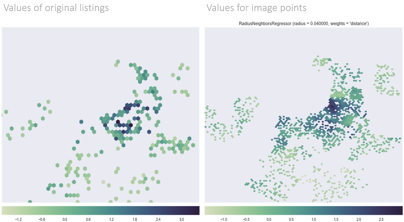
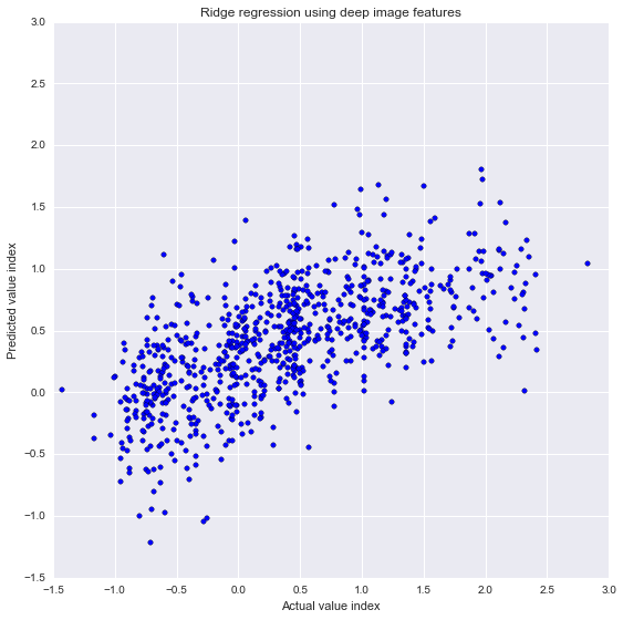
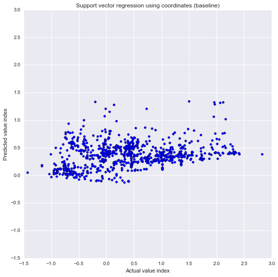
The last piece of the research is an evaluation about what connotations the idea of visual
similarity might have in non-visual aspects. I decided to asses whether we could predict housing
prices using image features.
Using web-scraping and API provided by Zillow,
I was able to collect 500+ housing price listings from the City of Boston. I assigned the values to the image
points and used
Ridge Regression to predict unit housing prices (normalized by area and housing type) based on
deep image features only. The chart below (left) is a scatter plot comparing the actual prices (X axis)
and the predicted values (Y axis). The prediction is not great (R squared = 0.4); but nevertheless
much better compared with the baseline model where I only used image coordinates as variables. Result:
Taking into consideration of what the place looks like results in a higher predictability.